Abstract:
This is my third independent project at Metis. The goal for this project is to help Lyft increase market share — Uber has 68% market share while Lyft has 32% nationwide. Scope and design the project, brainstorm the possible reasons that cause the difference.

My focus for this project is on demand and price, and my analysis is mainly based on total revenue of “pick up location” and “time of the day”. I analyzed & visualized the price and ride count relationships of Uber and Lyft to get some insights by using Excel. Then, I used Tableau for further analysis by building an interactive dashboard to communicate my results.

Background:
Uber owns 68% market share while Lyft only owns 32%. So, there’s an opportunity to help Lyft gain more market share if we know what caused the difference. Here are some possible reasons. Firstly, Uber’s service & UI may be better than Lyft (like shorter waiting time, UI is easier to handle, or Uber have more accurate updates) — solution: improve service & UI. Secondly, maybe the demand is high and Lyft doesn’t have enough drivers in the area. Then Lyft users have to switch to another rideshare app — solution: increase driver amount. Thirdly, maybe Lyft is more expensive. My project is mainly focused on the price and demand — adjust surge multiplier.
Lyft driver stats:
The vast majority of Lyft drivers (95%) drive for less than 20 hours per week. 96% of Lyft drivers work or study alongside their job as a driver. 15% of Lyft drivers are business owners. A further 12% are students. More than half of Lyft drivers (51%) also use other ride sharing platforms. 38% work on delivery platforms. (Source: Lyft.)
Notes for the ride sharing users: This analysis is only for study purpose, and only based on 1 day’s data in 2018 for Boston ride sharing market due to the excel capability. It can’t represent the whole market, please still keep using the share apps that you are current using. Both Uber & Lyft are providing incredibly good service.
Scope & Design project:
Business Impact: Help Lyft increase market share
Possible reasons: Service & UI, Demand & Supply, Price
Data Science Solution Path:
I am assuming price is the key factor, I want to build 2 regression models on Uber & Lyft dataset separately to predict price, then identify which locations and time of the day Lyft is overpriced by comparing the price with Uber. (Set a benchmark, eg: if Lyft’s price is 10% over than Uber, it will be identified as overprice)
Impact Hypothesis:
By finding out the difference in predicted price between Lyft & Uber, Lyft will be able to adjust “surge-multiplier” to provide a more competitive rate for each specific time slot & locations which result in a greater market share
Risk : Lyft drivers will receive less profit per ride, they may leave for another platform eventually.
Cost: we are reducing profit for each ride, if this doesn’t bring in more rides, then we will lose this part of the revenue.
Data:
Boston’s dataset cab_price data on Kaggle includes 600,000+ data points. I only selected one day’s data(11/26/2018 Monday) which includes 31,587 rows due to the capacity of Excel.
Assumptions:
Assumption 1: Lyft UI & Service are good, almost no user complains about it. Then demand and price may be the key factors of the difference.
Assumption 2: For data cleaning, I am assuming the Uber’s missing values is “missing at random”, the price for Uber is right skewed, so I filled null with median of Uber’s price(I didn’t drop null is because I wanted to keep the ratio of the ride counts between lyft and Uber, and all missing values are in Uber’s data)
Assumption 3: I am assuming there’s no difference in average distance of the rides between Uber & Lyft users for each location, then we can just compare the average final price.
Analysis in Excel:
Lyft is a bit more expensive than Uber, and Lyft has 48% market share in Boston. It is much higher than the national average which is pretty good, but there’s still room to increase.
Average final price: (DIFF: -$2.86) Uber $15.33 vs. Lyft $18.19
Average distance: (DIFF: 0.021 mile) Uber 2.198 miles vs. Uber 2.177 miles
Average Unit price: (DIFF: -$1.38/mile) Uber $6.97 vs. Lyft $8.35

Then, I compared by pick up location:

From my pivot table, There are 4 locations where the Revenue difference is over $3000;

From this graph, we can see at all pick up locations, Lyft’s average price per ride is more expensive than Uber; for “Haymarket Square”, Lyft & Uber’s average price per ride is about the same, but Uber gets 259 more rides, and around $3,000 more on revenues.
Then, I compared by time of the day:


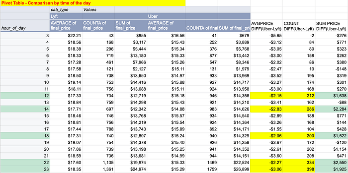
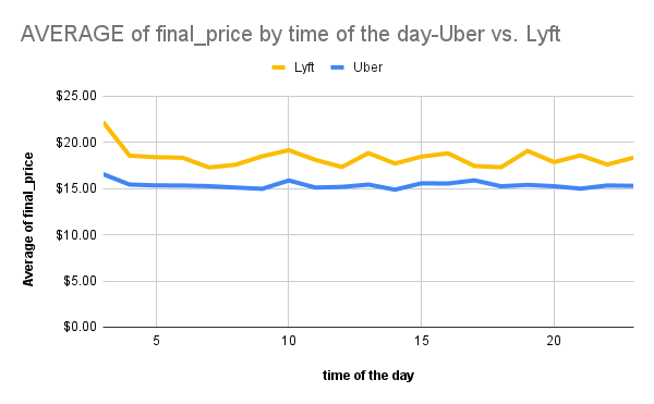
We can see from the graph, at each time of the day, Lyft has a higher average price per ride than Uber, there’s a big difference in Revenue between Uber & Lyft around 12pm, 2pm, 6pm, 10pm, and 11pm.
More details is available here: Google Sheet Link
Analysis in Tableau:
I used Tableau for further analysis on these four locations: “Beacon Hill”, “Haymarket Square”, “South Station”, “West End” which has a revenue difference over $3,000 with Uber(Uber-Lyft).

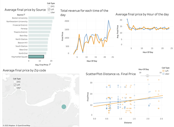
In my dashboard, the bar chart & geo graph is based on pick up locations, it currently selects Lyft only. The two line graphs are total revenue & average price base on each time of the day, colored by cab_type. The scatter plot is Price vs. Distance, colored by cab_type as well. We can also change the time range by moving the filter here. I checked out all of the 4 locations one by one.
Here are 2 examples. For “Beacon Hill”: at 4pm, Uber has 102 rides and Lyft only has 39 rides, but Lyft’s average price is not much higher than Uber, so it may be a supply issue.
For “West End”. It’s the same, around 10pm, Uber has 149 rides while Lyft has 93 rides, but no major difference on average price. It’s also a supply issue.

Link for a short video for these two example in Tableau: Google drive link
Link for interactive Dashboard in Tableau Public: Tableau Public
Example for Haymarket Square:

Conclusion:
- Price isn’t a key factor to increase market share in Boston.
2. Lyft may need to encourage more drivers to work at night time and morning time for our targeted areas.
3. Lyft may need to attract some new drivers to join in order to serve more users.
Future Work:
As I only used Monday’s data, it may not be able to represent the whole market, I would work on the entire dataset in python to see if the same pattern happens on every weekday, and what the pattern is for weekends. After that, we can start to plan out how to bring in more drivers to the Lyft family.
Appendix:
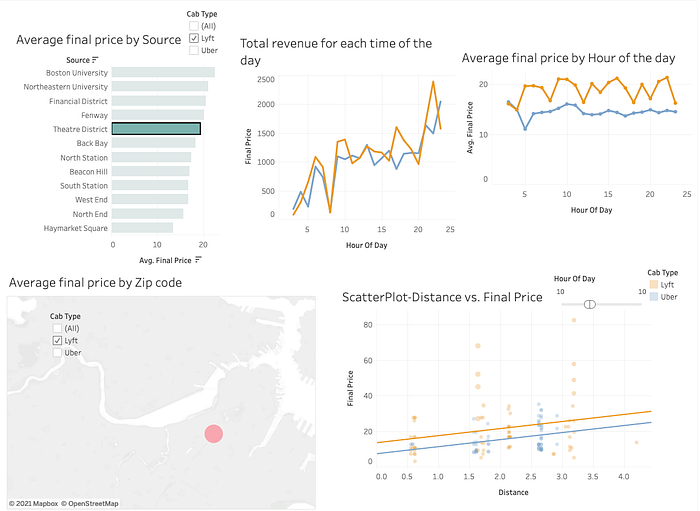
Here’s an opposite example: At Theatre District - Lyft’s average final price is higher than Uber, but revenue is higher as well at each time slot.

Whole project repo link: Github-Ridesharing-analysis
